If you are Silhouette Cameo 3, Cameo 4, or Curio owner and have plugged your machine into your computer, you will have access to the Stipple Panel.

With a Cameo 3 or 4, you can use a pen or marker to stipple a design. This means that the design is a series of dots. With this feature you can turn any design or photo into a stippled image.
With a Curio, the Stippling tool and the embossing mat can be used together to create the stippled design on other media types. With the Curio, it actually makes small indents in the material such as the Stippling metal sheets. The Stippling tool is designed to be used with the Curio machine.

- Stipple Edge – This option will add Stippling dots around the edges of the design on the screen.
 *Mama Needs Wine by Dawn Nicole Designs – Design #209918
 - Spacing – Adjust the spacing between the dots on the Stipple edge by increasing or decreasing the inches here.

- Stipple Fill – Choose from many fill options. The way it fills in with a stipple will vary with each design.

- Grid Spacing – Increase or decrease the grid spacing of the design being stippled.
 Here I have decreased the grid spacing on all the designs to 0.500 inches. This places more of the design and stipple into a smaller grid area on the original object.
 - Stipple Spacing – Increase or decrease the spacing of the stipple dots to be closer or farther from each other. Something to note here is that with some Stipple fill patterns, options may be grayed out because they do not apply. As you can see in the first 2 of my example here.
 Here I increased the Stipple spacing to 0.100 inches.
 - Scale Factor – Increase or decrease the scale of the points by a percentage.
 Here I scaled all of them down to 50%. As you can see, with each option, the look of the design changes and you can hardly recognize which options that I filled each with.
 - Angle – Change the angle of how the design fills the object.
 Above, the Angle is set for 135 degrees on all the designs.
 - Offset – This controls how far the fill pattern starts from the edge of the original design.
 Above, I have changed the offset to 0.250 inches and you can see that on all of the hearts, it has started the fill pattern 0.250 inches from the edge of the design.
 - Stipple Size – Change the size of the Stipple point.
 This option only changes the visual look of your design and does not change how big of a point the pen or tool will stipple.
 - Print Stipple – By checking this, the design can be sent to the printer to print the stippled image.
Keep in mind that the more dots you add to your design, the more details that is for your Studio program and computer to process. What does that mean? That means the more details you have in your design, the more data you computer is processing. If you experience a lag, be patient, the computer is working and will catch up.
Now, another thing to note, if you missed it in the beginning, is that this Stipple feature is only available for Cameo 3 or Curio owners, otherwise, the panel will be grayed out.
There are so many fun options to explore in the Silhouette software – hope you have fun creating today! Feel free to post on my Facebook group at Silhouette Secrets+ with EllyMae.
Enjoy !
THANK YOU for your support! How can you help? Click HERE & buy a coffee. Every little bit helps with the cost of running the site.
Looking for more in-depth, step-by-step classes, check out all of my online Silhouette classes on my Teachable site HERE.


 The bottom line is the score line for the center of the card. Match the score line up with the Guide created at 4.25″When the design is selected, a directional arrow in the center appears & that can be used to move and adjust the design and pop up features and vary the length of the design to pop out of the base.
 The farther down you pull the arrow, the more the features adjust.
 Pull the red dots on either side of the score line out to the edges of the card, so it will score a fold line to the edge of the card.

 Each line will now become it’s own separate piece and can be moved or deleted, as you see fit.
 Here I increased it to 57% to show you how it looks. Each design will vary in how it looks and the look you want to achieve.
 I increased the Min. Strut Width to 0.269″ and it changes so there are only 5 tabs at the top of my design.


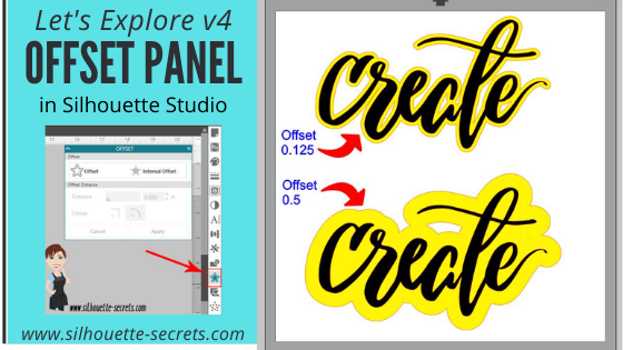


 *the offset is filled with yellow for you to see it better
*
*the offset is filled with yellow for you to see it better
* This is one way to fill a font that you want to use the sketch pens with. By creating multiple internal offsets, the sketch pen will “fill” the font in by drawing all the internal offsets.Here is an example of creating multiple internal offsets to “fill” in a font to sketch.
 This was many internal offsets, so many I lost track of how many I created.
First, I will say that it took a lot of ink to fill this in. I was using the Silhouette sketch pens and your results will vary depending on the pen you use and the tip it has on it.
This was many internal offsets, so many I lost track of how many I created.
First, I will say that it took a lot of ink to fill this in. I was using the Silhouette sketch pens and your results will vary depending on the pen you use and the tip it has on it.
 You can see above that even with multiple internal offsets, it did not fill in completely with the Silhouette sketch pen.
In some cases, it is not worth the ink or the time to use the sketch pens like this and would be easier to use the
You can see above that even with multiple internal offsets, it did not fill in completely with the Silhouette sketch pen.
In some cases, it is not worth the ink or the time to use the sketch pens like this and would be easier to use the 


 You will notice that the top text, the red lines from the characters overlaps the letter next to it. If you sent it to cut like this, it will cut out the red lines exactly how they show, so your letters would have cuts through them.
 By choosing to weld the font first, you can join the letters together so it cuts as one smooth piece. After you have welded, any piece of the text that is not overlapping will now be a separate object – like the dots of the i, so you want to make sure to Group them together to keep the text moving as one design.
When you weld text, it does change it from editable text to a vector image, so make sure to make a copy & pull it off to the side so you have the original in case you need to go back.
By choosing to weld the font first, you can join the letters together so it cuts as one smooth piece. After you have welded, any piece of the text that is not overlapping will now be a separate object – like the dots of the i, so you want to make sure to Group them together to keep the text moving as one design.
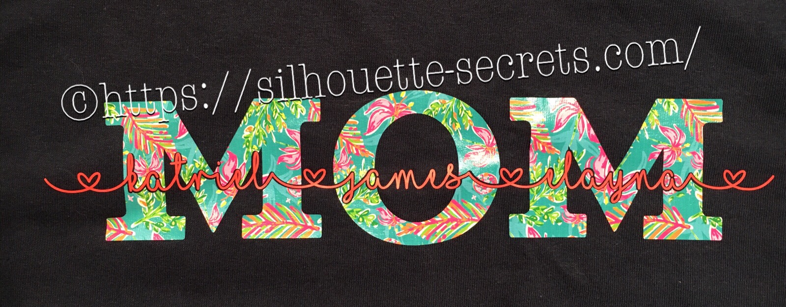
When you weld text, it does change it from editable text to a vector image, so make sure to make a copy & pull it off to the side so you have the original in case you need to go back. On top is the original design. Mom is typed out and behind the names.
When you select both designs and choose Subtract, it subtracts out the names (top layer) from the Mom design (bottom layer).
This works well for things like layering HTV where you don’t want the bulk of layering on your shirt or if you are using glitter HTV that is not recommended to be layered.
Tip: with this design, I would create an offset of the original names and then use the offset to subtract from the Mom design. It gives you a little more flexibility in placement when you apply it to the shirt.
On top is the original design. Mom is typed out and behind the names.
When you select both designs and choose Subtract, it subtracts out the names (top layer) from the Mom design (bottom layer).
This works well for things like layering HTV where you don’t want the bulk of layering on your shirt or if you are using glitter HTV that is not recommended to be layered.
Tip: with this design, I would create an offset of the original names and then use the offset to subtract from the Mom design. It gives you a little more flexibility in placement when you apply it to the shirt.
 I used a 0.20 offset on this design. Then moved the original name text away and used the Mom (bottom layer) and the offset (new top layer) to Subtract.
 Since I used an offset, this will allow you to place your names text inside of the area when applying the HTV and you won’t have to worry as much about shrinkage and getting it perfect.
 Move the name text back on top of your Subtracted design to get an idea of how it looks. On the top design, you have to get the exact placement of the names lined up with the bottom layer. On the bottom design, you will notice there is a bit of white showing around the name text, this will be beneficial when you are applying HTV so you don’t have to worry as much as about the HTV shrinking when you press each color.
 So above I drew a heart and moved it behind my Mom and name layers. Make sure to align the design how you want and then I chose Subtract All and it cuts out the top 2 layers from the very bottom layer (heart).
This works great for making designs that you don’t want to have the bulk of materials overlapping.
Again you could use an offset to help with ease of getting it lined up and not worrying about shrinkage.
So above I drew a heart and moved it behind my Mom and name layers. Make sure to align the design how you want and then I chose Subtract All and it cuts out the top 2 layers from the very bottom layer (heart).
This works great for making designs that you don’t want to have the bulk of materials overlapping.
Again you could use an offset to help with ease of getting it lined up and not worrying about shrinkage.

 Draw a heart over the photo, select both the photo and circle, then choose Crop and it will take that shape out of the layer under it.


 When you drag it on to the shape, it will replicate copies of that object around the shape. And you get another little circle (drag handle) on the shape to the right of the original object. By clicking and dragging on this drag handle you can increase or decrease the spacing between the objects on the path, this will also change the number of objects around the shape.


 At this point, all of your objects are now single objects, as you can see by the selection boxes around each. I would suggest grouping these together before you go further, so you don’t accidentally move one.


 Something to note about the Replicate and Mirror tools above is that it may look like the designs are overlapped, however, they are placed just perfect so when you cut, it will cut both lines.
 As you can see in the photo above, there is no overlap in the cut lines and both copies will cut just fine.


 In the photo above, I chose to make 3 copies, rotated to the right at 30 degrees. So each copy will rotate 30 degrees from the previous one.