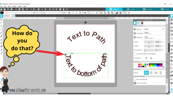
How do you place text around a circle? This is the question I see most often. It’s a very neat feature called Text to Path and it’s pretty simple to use.
I have updated this tutorial to include a video that is available on my
YouTube channel HERE.

Check out the full written tutorial below showing all the different aspects of Text to Path.
Text to path
*original post written 3/2019 created in version 4.2 of the Silhouette software – all features are still current and up to day for 3/2022 v4.4
Let’s explore how to take ordinary text and make it more interesting by adding it onto a path. The most common way I see this used is when you want the text to form to a circle or oval shape.
But why stop there? You can add text onto so many other paths.

Let’s take a look at how to do this.
Click on the Text tool on the left side, then click on the mat to get a text cursor and type out the text.

Next, I fill my text with color using the Fill Color Panel on the right side. This helps to see the text better and select the object easier.
Then, click on the Text Style Panel on the right side and change the text style.
Now, draw the shape that you want the text to snap to. Let’s start with an oval, since this is the most common shape I see users try to use.
Note: I have increased the Line thickness so that you can see my shape easier.

Double click on the text and a control point will appear in the bottom left corner.
Note: if the text has been changed in any way, such as welding or converting to path, it is no longer editable text and this will not appear.

Grab the control point and drag it to the object you want it to conform to.
When the text snaps to the shape, a slider bar will appear on the left side and the text can be adjusted.

Moving the slider up on the bar, moves the text out away from the shape.

Moving the slider down on the bar, moves the text inside of the line of the shape.
Make any additional changes to the text, such as increasing the character spacing, etc.
If you have a script text, right click and choose Weld.

This will weld any overlapping letters and then release the font from the shape.
Now, keep in mind that the text is no longer editable once it is welded. Make a copy and pull it to the side if you want to keep the original text to go back to.
Each font style is going to look different and you may need to adjust the character spacing on the Text Style Panel to make it overlap so it welds.
If the text is not overlapping, right click on the text and choose Convert to Path.

This will release the font from the shape.
Now, the text is a design and no longer editable text.
This is an important step, especially if you are cutting the design from HTV and need to flip the image before you cut. If the text is not converted to a path, it will not flip correctly.

Now, if that ever happens, you know why and how to fix it.
Make sure to convert to path or weld before you flip the design.
Now, let’s play with some shapes.
Flexi-Shapes are a great option to play with. This is a Designer Edition Plus or Business Edition upgrade feature only. Flexi-shapes are found on the left side.
More details on Flexi-Shapes can be found HERE.
I chose the star and then changed the points to 5.

I have increased the Line thickness again, so it can be seen better.
Now, type out the text.
If the text does not fit on one line, grab the teal slider bar on the right side and move it farther right, until all the text is on one line.

Now, grab the control point that appears in the bottom left corner of the text box and drag it to the shape. Move it around the shape until you have it how you like.

Each font and shape will vary in what looks better or if it splits words, etc. Play with the character spacing, the text size, and more until the desired look is achieved.
Want the text on a wave?
Use the Draw Curve Shape found under the Line tools on the left side and draw your wave.

Type out the text, grab the control point in the bottom left, and drag to the wavy line.

When it’s positioned how you like, right click and choose Convert to Path. Now, the line can moved away.

Now, what can you think of to create with the Text to Path feature?
What about adding to a pre-made design to personalize it?


Or inside a banner?

A design for a card or a sign on a wall?

Each one of these shapes works a bit differently and you will need to play with it to see how the Text to Path snaps to the image.
Don’t forget to make a copy of the design before right clicking on the image and choosing Convert to Path.
I would love to see what you create with this feature!
Affiliate links may be present in the following blog post and as an Amazon Associate I earn from qualifying purchases.
Here are some of the designs used in the examples above:
Heart Arrow by Sophie Gallo – Design #177769
Hot Air Balloon by Rhonna Farrer – Design #182992
Banner by American Crafts – Design #19529
Banner by Skyla Design – Design #267349
Basic Banner by Silhouette – Design #141887
Baby Footprint Heart by Studio Illustrado – Design #198883
I would love to see what you are creating with your Silhouette software or machines!
Or if you have any questions, feel free to post photos or questions on my Facebook group at
Silhouette Secrets with EllyMae.
Save this for future reference by pinning the image below.

Enjoy !
THANK YOU for your support! How can you help? Click HERE & buy a coffee.
Every little bit helps with the cost of running the site.
Silhouette Classes
Never stop learning! Let me help you take the anxiety out of learning with Silhouette and get to creating faster! My Silhouette classes are heavily focused on software, so you can take the skills & techniques taught and apply them to many future projects!


 Objects can be grabbed and dragged to rearrange the order within the Layers Panel.


 The bottom line is the score line for the center of the card. Match the score line up with the Guide created at 4.25″When the design is selected, a directional arrow in the center appears & that can be used to move and adjust the design and pop up features and vary the length of the design to pop out of the base.
 The farther down you pull the arrow, the more the features adjust.
 Pull the red dots on either side of the score line out to the edges of the card, so it will score a fold line to the edge of the card.

 Each line will now become it’s own separate piece and can be moved or deleted, as you see fit.
 Here I increased it to 57% to show you how it looks. Each design will vary in how it looks and the look you want to achieve.
 I increased the Min. Strut Width to 0.269″ and it changes so there are only 5 tabs at the top of my design.


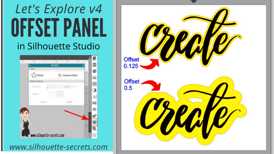


 *the offset is filled with yellow for you to see it better
*
*the offset is filled with yellow for you to see it better
* This is one way to fill a font that you want to use the sketch pens with. By creating multiple internal offsets, the sketch pen will “fill” the font in by drawing all the internal offsets.Here is an example of creating multiple internal offsets to “fill” in a font to sketch.
 This was many internal offsets, so many I lost track of how many I created.
First, I will say that it took a lot of ink to fill this in. I was using the Silhouette sketch pens and your results will vary depending on the pen you use and the tip it has on it.
This was many internal offsets, so many I lost track of how many I created.
First, I will say that it took a lot of ink to fill this in. I was using the Silhouette sketch pens and your results will vary depending on the pen you use and the tip it has on it.
 You can see above that even with multiple internal offsets, it did not fill in completely with the Silhouette sketch pen.
In some cases, it is not worth the ink or the time to use the sketch pens like this and would be easier to use the
You can see above that even with multiple internal offsets, it did not fill in completely with the Silhouette sketch pen.
In some cases, it is not worth the ink or the time to use the sketch pens like this and would be easier to use the