Who doesn’t love a surprise? And that is just what I received when Silhouette America asked if I wanted to check out their new Mystery box.
When I opened the box, look what I saw:

Plus a pack of the Kraft Adhesive paper that arrived on my doorstep, it must have forgotten to jump in the box and was just another bonus to the mystery box.

And now the fun part of playing with these materials.
I grabbed some designs from the Silhouette Design Store and tackled something I’ve had on my project list.

I used the Leatherette package and the sketch pens to create these earrings and earring cards.
First, I started off making the earring holders.
I cut several different styles but I ended up really liking Design #14057 by Loni Stevens.

But, I knew I could add to the earring holder, so I decided to dress them up a bit with the Silhouette sketch pens. I received the Metallic set in my mystery box and after testing several, the silver was my favorite.
I could have told you that before I tested, but I still gave all the colors a chance.

To make the dashed sketch line:
– Make a copy of the outer edge of the earring holder design
– Resize the copy a little smaller – either by the Scale panel or by dragging the corner bounding box
– Use the Line Style Panel and change the style of the line to a dashed line
– Also under the Line Style Panel change the color of the line to black.
– Select the dashed line, click on the Send Tab and then click on the
Action by: Line at the top –
this means the Cameo will perform the actions we tell it to by the Line Color

– Grab the black color option and move it to the top spot –
this action will be performed first
– Change the Tool No. to the blue circle (blue circle = Tool 2)
– Select your Material – Cardstock
– Change the Action to Sketch
– Check & set up the Cut settings for the red line
Now when the design is Sent, it will first sketch the design that has been changed to a black Line color – the dashed line and then after will cut the lines that are red.
Next, I used the Nouradilla Script Font and added my name and Silhouette Secrets to the earring holder as well. Change the line color to black under the Line Style Panel and it will sketch at the same time as the dashed line.
Once I started cutting, it was hard to stop. I do love how this Leatherette cut so smoothly. I started with brand new blade and mat and I believe it made a big difference in how cleanly it cut. In fact, the more I cut and the less sticky my mat became, the cuts weren’t as crisp. A sticky mat makes a big difference.

This was the first set I cut and might be my favorite. It is Leaf Earring design by Lilium Pixel SVG – Design #266977. The only thing I changed on this file was I released the Compound Path and deleted the top circle for the hardware. After I deleted the circle in each, I selected the entire design and then chose Make a Compound Path again.
I then made a copy of the earring design and right clicked and Flipped horizontally. This made a 2nd copy that I could glue together and make the back have a finished look. I used a Xyron Sticker Maker permanent adhesive to do this.

Lined Leaf Earrings by Amanda McGee – Design #275057
Leaves Earrings by Amanda McGee – Design #275058
This design was modified to take out the top circles like the first file and then cut & glued together with the Xyron Permanent Adhesive.

Tear Drop Earrings by Sweet Elsie – Design #273510
– Ungroup the design
– Release the Compound Path and deleted the hardware circle at the top.
– Make a copy and Scale the copy down a little
– Make another copy and Scale it down a little more
– Cut each out of a different color and layer on the earring hardware
You could also use glue and adhere the layers down to each other but I chose to let them hang loose.
Rather than try to get each design to match, I deleted one of the original designs, made my copies and resized how I liked and then make a copy of the entire design before I cut. Then both earrings matched exactly.

Leaf Earrings by Lori Whitlock – Design #268363
I once again ungrouped the design, released the compound path and then deleted the top circle. You might see a pattern here.
It is nothing to do with the Designer’s file, but for the Double J Earwire hardware I had from Craft Chameleon, it was easier to make my own hardware hole.

Drop Earrings by Sweet Elsie – Design #273506
I did the same technique with making copies and resizing as I did with the Tear Drop earrings above.

Layered Feather Earrings by Amanda McGee – Design #275059
This file was cut exactly as it opened.
Again, you could glue the layers down if that is your desired look.

For this set, I took the Tear Drop Earrings by Sweet Elsie – Design #273510 and then added a dingbat from the Valentine Dingbats Font by Lori Whitlock – Design #243211.
– Make a copy of the Tear Drop design
– Add the dingbat shape from the font to one of the designs
– Select both the earring shape and the dingbat shape, then make a compound path
– Cut each shape out of the colors
– Glue the layers together
All of the earrings above were cut from the Silhouette Leatherette using the Leatherette cut settings in the program and it worked beautifully.

Again, I did start with a brand new blade and mat, which I believe was very helpful.
The Silhouette cutting mat is very important and the material sticking to the mat for the entire cut is key to getting crisp, clean cuts for all materials.
If the material moves as the blade is going around, it cannot connect exactly and you end up with crunched corners, cuts not connected, frustration and possibly a mess.
I’d suggest always having an extra Silhouette mat & blade on hand for any projects you are doing.
Save this for future reference by pinning the image below.

Enjoy !
THANK YOU for your support! How can you help? Click HERE & buy a coffee. Every little bit helps with the cost of running the site.
Silhouette Classes
Never stop learning! Let me help you take the anxiety out of learning with Silhouette and get to creating faster! My Silhouette classes are heavily focused on software, so you can take the skills & techniques taught and apply them to many future projects!


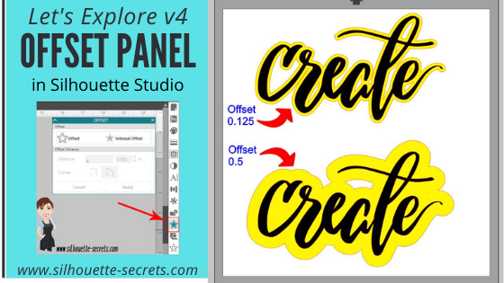


 *the offset is filled with yellow for you to see it better
*
*the offset is filled with yellow for you to see it better
* This is one way to fill a font that you want to use the sketch pens with. By creating multiple internal offsets, the sketch pen will “fill” the font in by drawing all the internal offsets.Here is an example of creating multiple internal offsets to “fill” in a font to sketch.
 This was many internal offsets, so many I lost track of how many I created.
First, I will say that it took a lot of ink to fill this in. I was using the Silhouette sketch pens and your results will vary depending on the pen you use and the tip it has on it.
This was many internal offsets, so many I lost track of how many I created.
First, I will say that it took a lot of ink to fill this in. I was using the Silhouette sketch pens and your results will vary depending on the pen you use and the tip it has on it.
 You can see above that even with multiple internal offsets, it did not fill in completely with the Silhouette sketch pen.
In some cases, it is not worth the ink or the time to use the sketch pens like this and would be easier to use the
You can see above that even with multiple internal offsets, it did not fill in completely with the Silhouette sketch pen.
In some cases, it is not worth the ink or the time to use the sketch pens like this and would be easier to use the 


 You will notice that the top text, the red lines from the characters overlaps the letter next to it. If you sent it to cut like this, it will cut out the red lines exactly how they show, so your letters would have cuts through them.
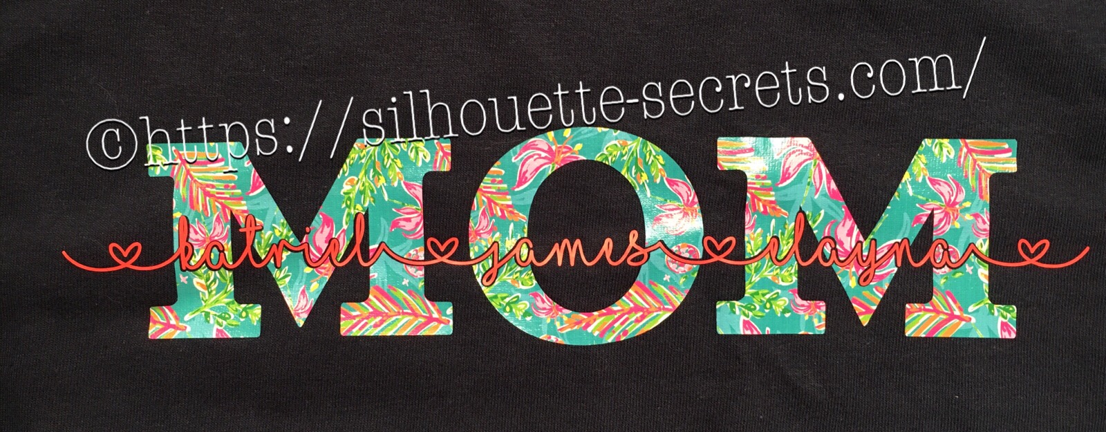
 By choosing to weld the font first, you can join the letters together so it cuts as one smooth piece. After you have welded, any piece of the text that is not overlapping will now be a separate object – like the dots of the i, so you want to make sure to Group them together to keep the text moving as one design.
When you weld text, it does change it from editable text to a vector image, so make sure to make a copy & pull it off to the side so you have the original in case you need to go back.
By choosing to weld the font first, you can join the letters together so it cuts as one smooth piece. After you have welded, any piece of the text that is not overlapping will now be a separate object – like the dots of the i, so you want to make sure to Group them together to keep the text moving as one design.
When you weld text, it does change it from editable text to a vector image, so make sure to make a copy & pull it off to the side so you have the original in case you need to go back. On top is the original design. Mom is typed out and behind the names.
When you select both designs and choose Subtract, it subtracts out the names (top layer) from the Mom design (bottom layer).
This works well for things like layering HTV where you don’t want the bulk of layering on your shirt or if you are using glitter HTV that is not recommended to be layered.
Tip: with this design, I would create an offset of the original names and then use the offset to subtract from the Mom design. It gives you a little more flexibility in placement when you apply it to the shirt.
On top is the original design. Mom is typed out and behind the names.
When you select both designs and choose Subtract, it subtracts out the names (top layer) from the Mom design (bottom layer).
This works well for things like layering HTV where you don’t want the bulk of layering on your shirt or if you are using glitter HTV that is not recommended to be layered.
Tip: with this design, I would create an offset of the original names and then use the offset to subtract from the Mom design. It gives you a little more flexibility in placement when you apply it to the shirt.
 I used a 0.20 offset on this design. Then moved the original name text away and used the Mom (bottom layer) and the offset (new top layer) to Subtract.
 Since I used an offset, this will allow you to place your names text inside of the area when applying the HTV and you won’t have to worry as much about shrinkage and getting it perfect.
 Move the name text back on top of your Subtracted design to get an idea of how it looks. On the top design, you have to get the exact placement of the names lined up with the bottom layer. On the bottom design, you will notice there is a bit of white showing around the name text, this will be beneficial when you are applying HTV so you don’t have to worry as much as about the HTV shrinking when you press each color.
 So above I drew a heart and moved it behind my Mom and name layers. Make sure to align the design how you want and then I chose Subtract All and it cuts out the top 2 layers from the very bottom layer (heart).
This works great for making designs that you don’t want to have the bulk of materials overlapping.
Again you could use an offset to help with ease of getting it lined up and not worrying about shrinkage.
So above I drew a heart and moved it behind my Mom and name layers. Make sure to align the design how you want and then I chose Subtract All and it cuts out the top 2 layers from the very bottom layer (heart).
This works great for making designs that you don’t want to have the bulk of materials overlapping.
Again you could use an offset to help with ease of getting it lined up and not worrying about shrinkage.

 Draw a heart over the photo, select both the photo and circle, then choose Crop and it will take that shape out of the layer under it.